Creating effective poster presentations
Creating an effective poster presentation
Depending on your program of study, you might be asked to create a poster presentation as part of an assessment. Learn how to design an effective poster presentation that balances text with graphics and helps your audience understand the main points of your work.
What is a poster presentation?
A poster presentation is a visual display, usually on a large poster board, that communicates the key points of a study, project, or topic. It often includes images, diagrams, flowcharts and other graphics, and bullet points are often used to highlight the main ideas. Poster presentations are common at conferences and other academic and professional events.
While your poster might be presented to your peers with a short talk or discussion, the content and message of your poster need to be expressed clearly and concisely, in a way that is easy for your audience to understand without further explanation.
Below are some tips to help you create an effective poster.
Ideas for getting started
-
Read your assignment brief carefully
It is always a good idea to have a clear understanding of the assessment criteria of your assignment. This way, you will know what the person who is marking your work will be using to grade your assignment. It is recommended that you read through the assignment instructions carefully and highlight keywords and keep these in mind throughout the planning phase of your assignment. You could use the criteria as a checklist when you have finished your draft, to ensure that you have covered everything that you needed to cover
Also, check if there are any requirements regarding the dimensions, font sizes or layout of your poster because if these requirements are not met, this could lead to a lower grade.
-
Contact the library
Don’t know where to look for information? Get in touch with a Librarian through the Ask the Library chat service.
They can help you find the best search terms to use, show you how to filter results, and help you identify which databases to use for your subject area.
-
Know your audience
Think about who it is that you will present the information to. Are they professionals in your field? Are they members of the general public?
Understanding your audience will help you to decide what content to include and the language you should use to communicate your work. Technical language and excessive jargon is not always appropriate for every assignment. Ensure that your message is clearly communicated to the target audience.
What to include
This will depend on the purpose of your poster. For example, are you telling an audience about research that you conducted? You might decide that your audience needs to know why you conducted the research, how you did it, who participated in it, what the results were and what the implications of the results are.
In this case, you might decide to follow a typical report structure of an introduction, methods, results, conclusion and discussion sections. For another type of project, you may need to include a literature review section or recommendations. And don’t forget to include your references.
If you are confused about how to structure your work, you can contact an Academic Skills Advisor through the Ask the Library service to get some feedback and advice.
Design considerations
Carefully consider the design of your poster, as this will affect how your audience engages with your information. Remember that you should include a mixture of writing and visual aids such as images, graphs, tables and charts.
Layout
Below are some points to consider for the layout of your poster:
Consider whether your poster would be best in landscape or portrait orientation.
Your information should flow in a logical way, e.g., left to right, from the centre outwards, or in columns.
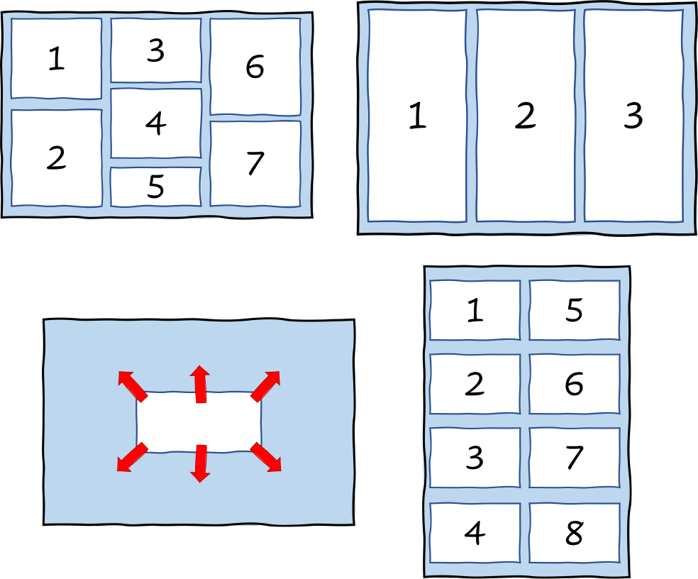
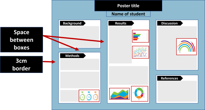
Make sure that your poster is not overcrowded. There should be space around each section, as this will increase the readability of your work.
Include a border of 3cm around your poster.
Images
Part of your message will be conveyed through images, so they should be chosen carefully. Keep in mind the following:
Images should be meaningful, not decorative.

Remember to add citations, attributions and captions to images. If you are not sure how to properly cite an image or include a caption, visit Easy Cite for guidance on a variety of referencing styles.
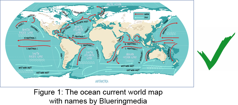
Do not use overly complicated graphs, charts or tables. Rather, aim to include graphic information that is clear and easy to understand.

Remember, you can't include everything in your poster. Choose the most important data, graphs, and images to include. You can expand upon your poster in an accompanying presentation.
Text
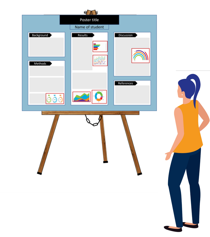
Include a title that stands out and catches your audience’s attention. In physical settings, your title should be able to be read from 2-3 metres away.
For font sizes, it is recommended that you use:
- 80-96 for titles
- 30-36 for headings
- 18-24 for body text
Other factors to consider are:
Where possible, use bullet points to make your text more concise and help your reader to focus on the main ideas of your poster.
Choose your text and background colours carefully to ensure that your work is readable.

Use sans serif fonts, which are typefaces without decorative feet such as Arial or Calibri, as they are easier to read than serif fonts.

Do not use decorative or overly stylised fonts such as Comic Sans, as they are not considered academic.

Technology for creating your poster
There are many apps and programs that can help you to design and create your poster. They include:
- Microsoft PowerPoint
- Canva
- Adobe Illustrator
- Adobe InDesign
- Microsoft Publisher
They each have their pros and cons, so it is recommended that you try a few and see what works best for you. Some free software and apps are available for RMIT students.
Once you have made your first successful poster presentation, especially if you receive good feedback for it, you can use it as a template for future presentations.
Academic writing
It is highly likely that your tutor or lecturer will request that you follow academic style conventions in your poster, such as avoiding personal pronouns and contractions, and using formal language. For help with academic style, you can make an appointment with an Academic Skills Advisor to review your work and get advice.
Images by Cifotart, ilyanatty, soyon, blueringmedia, Dennis Cox and Gstudio on Adobe Stock
