Dry data is often hard to digest. Infographics turn information into engaging visuals, capturing attention and improving communication. On this page, we'll cover key considerations for presenting your information effectively.
Successful infographics:
convey complex messages clearly and concisely
contain visual elements that communicate a message
use a minimum amount of text, which should be carefully worded
have a logical flow of information
require the audience to spend little time and effort to receive the message.
Where to start
Before starting, analyse the assignment instructions. Check for details like:
Required topic areas
Formatting requirements
Software to use
Presentation format (printed or online, specific file formats)
Referencing requirements
Remember that your content and explanations should be tailored to your audience — this could be teachers, classmates, industry professionals, or the general public. For example, the general public often needs more context than professionals.
What is your objective?
Your objective will influence how you communicate your message. For example, if you are trying to catch people's attention, then bold colours might be a good choice. For sensitive topics, subtle colours may be more appropriate.
Some examples of objectives are:
communication of data/statistics/information
presentation of a timeline
telling a story
outlining a process
visualisation of a theory or method.
What content do I include?
Make sure your message is focused. You can't include an entire data set or explain complex theories in depth in an infographic. Select a few key points to highlight. Too much information can reduce audience engagement and dilute your main message.
Use simple language to increase the readability of your work. Avoid long sentences, complicated language and jargon.
Design
Here are some tips to get maximum impact from your infographic:
The flow of information should be logical and help tell the story. Use elements such as numbers, colours, lines and arrows to guide the reader from one point to the next.
Keep your infographic uncluttered. Space around visual elements and text will help your main message stand out.
Put the most important point or information at the top. In western culture, we read top left to top right and then down, losing focus and interest.
In a huge infographic, people might only read some of it. Consider this when creating your infographic.
Emphasis can catch your audience’s eye and their attention.
If you do really want to emphasise a number, make sure you emphasise the what just as much, with a bold word or a picture.
Layout
There are many ways that you can organise your infographic. Here are just a few of them:
Stacked layout
Information is "stacked" on top of each other in a single column, guiding the reader from the top of the page to the bottom.
Use this layout for:
timelines and processes
presenting information from most important to least important.
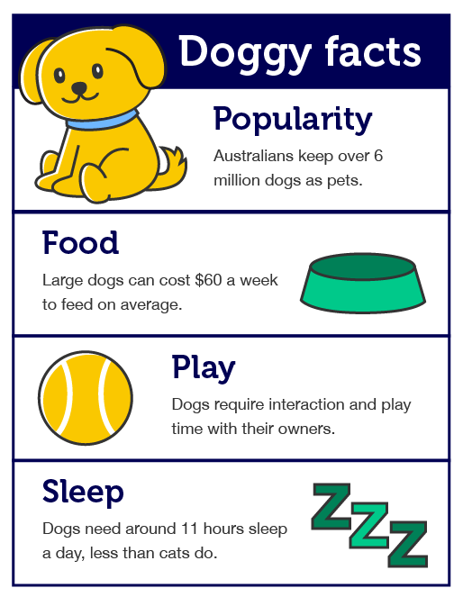
An example of the stacked layout where each section is stacked one above the other.
Doggy facts
Popularity: Australians keep over 6 million dogs as pets.
Food: Large dogs can cost $60 a week to feed on average.
Play: Dogs require interaction and play time with their owners.
Sleep: Dogs need around 11 hours sleep a day, less than cats do.
Comparison layouts
These can be used if you want to highlight the differences between two or more items. Items are placed side by side so that similarities and differences can be easily identified.
Use this layout to:
compare the benefits and drawbacks of different theories
show the differences between two policies or products
represent results of different test groups.
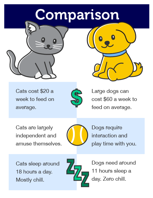
An example of a comparison layout, where two items are compared side-by-side.
Comparison
Feeding Costs
Cats cost $20 a week to feed on average.
Large dogs can cost $60 a week to feed on average.
Independence
Cats are largely independent and amuse themselves.
Dogs require interaction and play time with you.
Sleep
Cats sleep around 18 hours a day. Mostly chill.
Dogs need around 11 hours sleep a day. Zero chill.
Timeline layout
Timelines are great for conveying time-related information in a clear way. Points or steps are organised chronologically so that
audiences can move from one step to the next in a logical way. This format is great for storytelling.
Use this layout to:
Describe the stages in the development of a theory or a product
Show how a company was established.
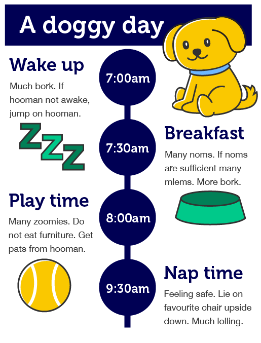
An example of a timeline layout showing showing the times that different events or activities occur.
A doggy day
7:00am: Wake up
Much bork. If hooman not awake, jump on hooman.
7:30am: Breakfast
Many noms. If noms insufficient, many mlems. More bork.
8:00am: Play time
Many zoomies. Do not eat furniture. Get pats from hooman.
9:30am: Nap time
Feeling safe. Lie on favourite chair upside down. Much lolling.
Circular layout
This layout helps to show how a process move from one stage to another and guides the audience's eyes in a logical manner.
Use this layout to:
describe a process or procedure
represent a lifecycle of an animal or a product.
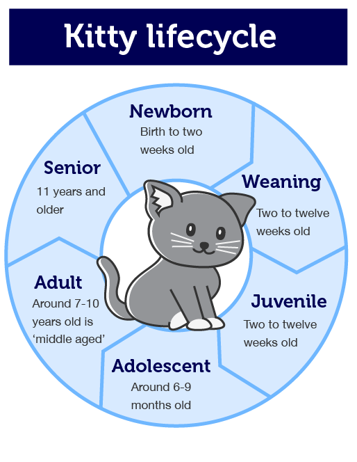
A circular layout being used to explain the stages in a lifecycle.
Kitty lifecycle
Newborn: Birth to two weeks old
Weaning: Two to twelve weeks old
Juvenile: Two to twelve weeks old
Adolescent: Around 6-9 months old
Adult: Around 7-10 years old is 'middle-aged'
Senior: 11 years and older
Data-heavy layout
Do you have A LOT of numbers and figures to communicate? Use a data-heavy layout to group information into logical chunks.
Separate information into categories by using colours and accompany text with meaningful icons.
Use this layout for:
highlight the results of a research report
convey statistical information.
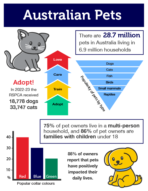
A data-heavy layout with information and statistics distributed throughout an infographic.
Australian pets
There are 28.7 million pets in Australia living in 6.9 million households. Popularity of pets by types (most popular to least):
Dogs
Cats
Fish
Birds
Other (small mammals, reptiles)
Adopt!
In 2022, the RSPCA received 18,770 dogs and 33,747 cats.
Adopt
Train
Care
Love
75% of pet owners live in a multi-person household, and 86% of pet owners are families with children under 18. 85% of owners report that pets have positively impacted their daily lives.
Popular collar colours:
Red
Blue
Green
Images and visual elements
Visual aids are a must for infographics and they can come in many forms including graphs (e.g. line, bar, pie), tables, maps, images and icons.
When choosing or designing visual elements, opt for clear and simple designs that can be easily understood by the audience. Avoid packing too much information into graphs and consider how you can make key information from graphs stand by using larger text and icons.
When it comes to choosing images for your infographic:
choose images that are appropriate to your topic that help the audience to understand your message.
make sure that images accurately represent the information. For example, if your content relates to sizes, make sure you have the correct scale.
keep your style consistent. For example, try using images from one artist as using images from multiple artists and mixing illustrations and photographs often result in an inconsistent style.
if an image was created by someone else, don't forget to reference or credit the creator.
Text
Text should tell some of your story, but not all of it. Keep text to a minimum and use key words and phrases rather than full sentences where possible.
Choose clear font styles and sizes that can be easily read.
If you plan to print your infographic, ensure that text is readable at arms distance. Use a font size of at least 14pt for body text and larger for headings. Test readability by printing a small section to confirm the text is clear and easy to read.
Platform
For some assignments, a specific platform is required; for others, you can choose. Popular options include Miro, Canva, and Adobe Express. Check if the service is free and if there are any limitations to the features you can use when accessing the free version of the tool.
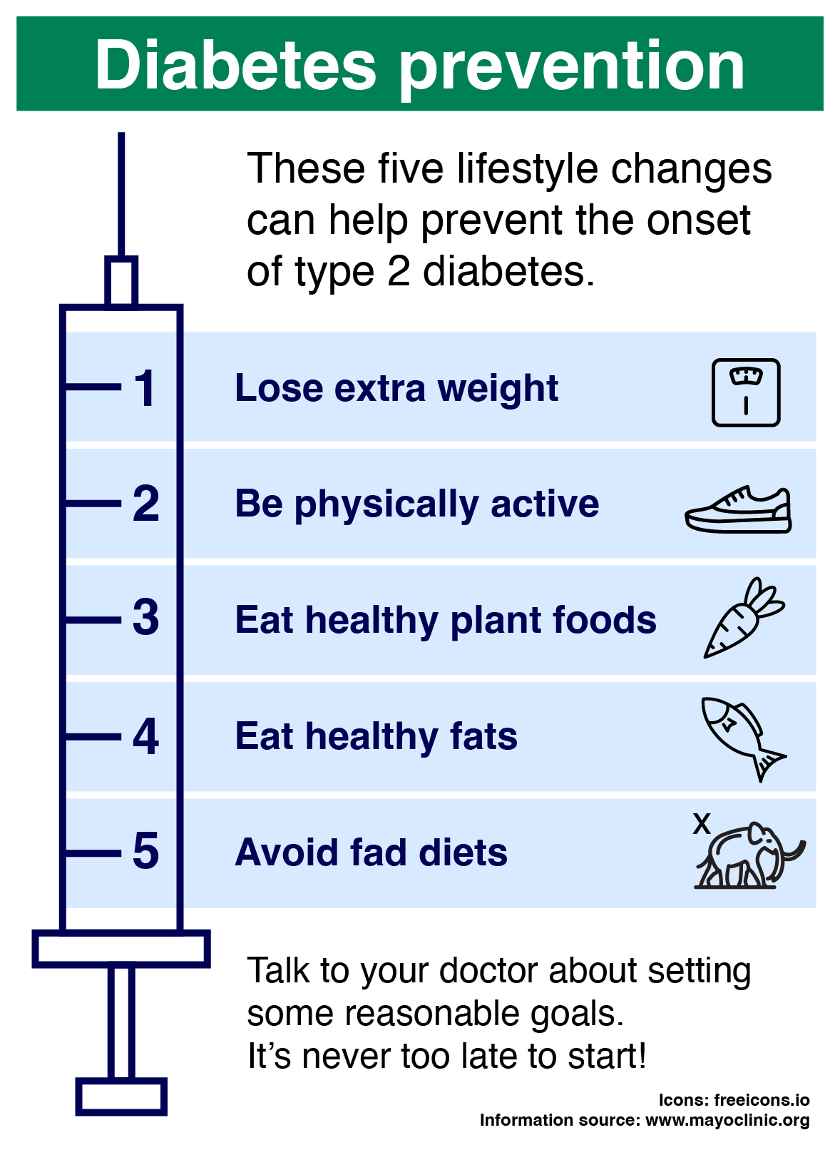
Student example
Here is an example of an infographic that has been made for an assignment.
Carlos is a health sciences student who has been asked to make an infographic to help combat the recent rise of diabetes in the Australian population. Instead of proving exhaustive background information about what diabetes is and how it is caused, he decided to create an infographic that could be placed in the waiting rooms of medical clinics that gives simple pieces of advice that could help people lower their risk of diabetes.
Notice how Carlos has: – used the image of a syringe to tie the five points together in a way that matches the theme of the information – illustrated the points with icons in a consistent style – used sufficient contrast and easy-to-read fonts – credited the source of his information and illustrations. Icons by freeicons.io
Diabetes prevention
These five lifestyle changes can help prevent the onset of type 2 diabetes.
Lose extra weight
Be physically active
Eat healthy plant foods
Eat healthy fats
Avoid fad diets
Talk to your doctor about setting some reasonable goals. It’s never too late to start!
Images by RMIT, licensed under CC BY-NC 4.0. Please note that the data is not accurate and is for illustrative purposes only.