Digital accessibility means creating content in a way that users of all abilities can engage with them. Let's discover some tips that will help make your assignments accessible for everyone.
Why is accessibility important?
Here are just some of the many reasons:
Inclusion: Accessibility recognises that people experience the world differently, with varying abilities affecting how they access content. For example, individuals with vision impairments may rely on screen readers or require specific font sizes and styles. To ensure our content is truly accessible, we must consider the diverse needs of all individuals.
Social responsibility: By creating accessible content, we help build a world where individuals of all abilities feel valued and included.
Preparation for future careers: Understanding accessibility is an essential skill in many careers today. People who are knowledgeable about accessibility are often highly valued by employers.
Audience consideration: Consider the diverse needs of your audience when creating assignments. Ensuring accessibility allows a wider range of people to engage with your work.
What can I do to make my assignments accessible?
This is a complex and evolving area, but everything you do will make a difference to many people. Here are some small considerations that can have an instant impact.
Colour contrast
Consider the colours of your text and your background. If there is poor colour contrast, it will be difficult for some members of your audience to read.
It is best not to assume that your text and images have good colour contrast — using an accessibility checker like WebAim is much more reliable.
Captions and transcripts
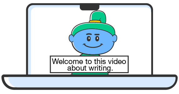
Video presentation, by RMIT, licensed under CC BY-NC 4.0
For any videos in your assignment, make sure that you include captions. This allows people who are not able to hear the audio to access its content. Captions are also useful for people who may have difficulty understanding the speakers in the video.
For videos, audio and complicated images, transcripts can be provided to allow your audience to read a text-based version of the dialogue.
Don't use colour alone to convey meaning
For those with colour vision deficiency (colour blindness), it can be difficult to distinguish between some colours. Therefore, when colour is used to convey meaning, this information can be missed.
An example of this is a graph that has a key showing that different colours represent different piece of information. In this case, it is more inclusive to use patterns as well as colour. Also, it is good practice to provide a transcript of graphs to assist screen reader users.
Alternative text
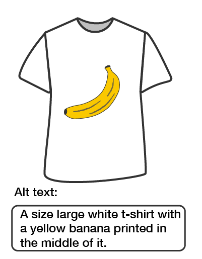
Alt text, by RMIT, licensed under CC BY-NC 4.0
Members of your audience using screenreaders will not be able to percieve the images you have included unless you provide alternative text (also known as alt text). This is text added to your images that will be read out by screen readers to describe the image.
Please note that alt text should only be included for images that add meaning to your assignment. If the image is purely decorative, alternative text does not need to be provided. In some programs, you can mark these images as 'decorative', and if you are creating a web page, you should include an empty alt tag (e.g. alt="").
When writing alternative text:
be concise: avoid wordy descriptions
think about the context: what is it about the image that the reader needs to know to understand how the image fits into your assignment?
Avoid text in images
Where possible, avoid including images that contain text in your assignments. The text in the image will not be picked up by screen readers. It is better to put the text into the page.
That said, sometimes text in an image is not practically avoidable – for example in a screen-shot, a detailed diagram, or a chart. In this case, you avoid using text in images as the only method of conveying important information. For example, you could provide alt text or a transcript of the text from the image.
Meaningful link text
If your assignment contains links to other web pages, it is best practice to use meaningful link text. What does this mean exactly?
Avoid using text in your links such as 'click here for more' or full URLs to pages — readers of your work won't know where they'll be taken by the link.
Instead, use text that makes it clear which page they will be taken to. Here are some examples:
Link destination: RMIT Equitable Learning Services homepage. Example: For more information, visit RMIT's Equitable Learning Services page.
Text that is small is difficult for people with vision imapairments to read. Use a minimum of 12pt in documents and 16px for web page for your assignments.
Some font styles can be difficult to read for people with low vision. Increase the readability of your assignment by avoiding cursive, decorative and serif fonts.
Heading hierarchy
Using heading styles such as 'title', 'heading 1', 'heading 2', etc. makes your work easier to skim and scan. Also, for people with low vision and for people who use screen readers, it makes your work more navigable.
Headings should be nested semantically. A page should only have one heading 1. Heading 2 should be used for main sections and heading 3 for sub-sections. Choose your heading level for its purpose, not how it looks, and be consistent.
Where can I learn more?
Accessibility is an evolving concept. What is considered best practice may change in the future as technology and practices develop. A reliable source of the best current practices are the Web Content Accessibility Guidelines (WCAG).